
“…Campaigns with personalized subject lines
achieve higher open rates than those
with subject lines that are not personalized.”
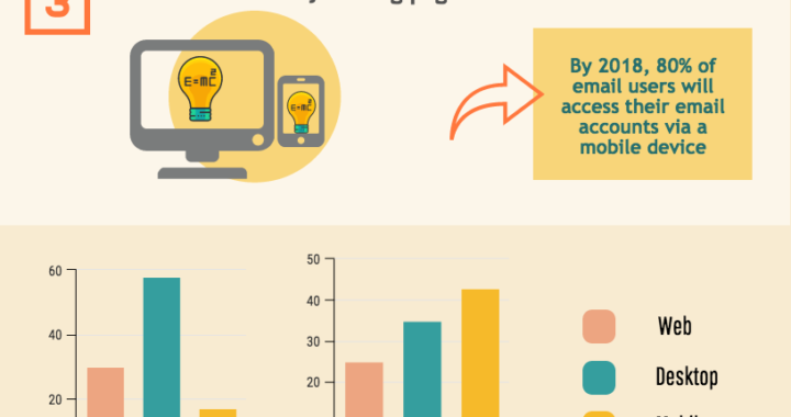
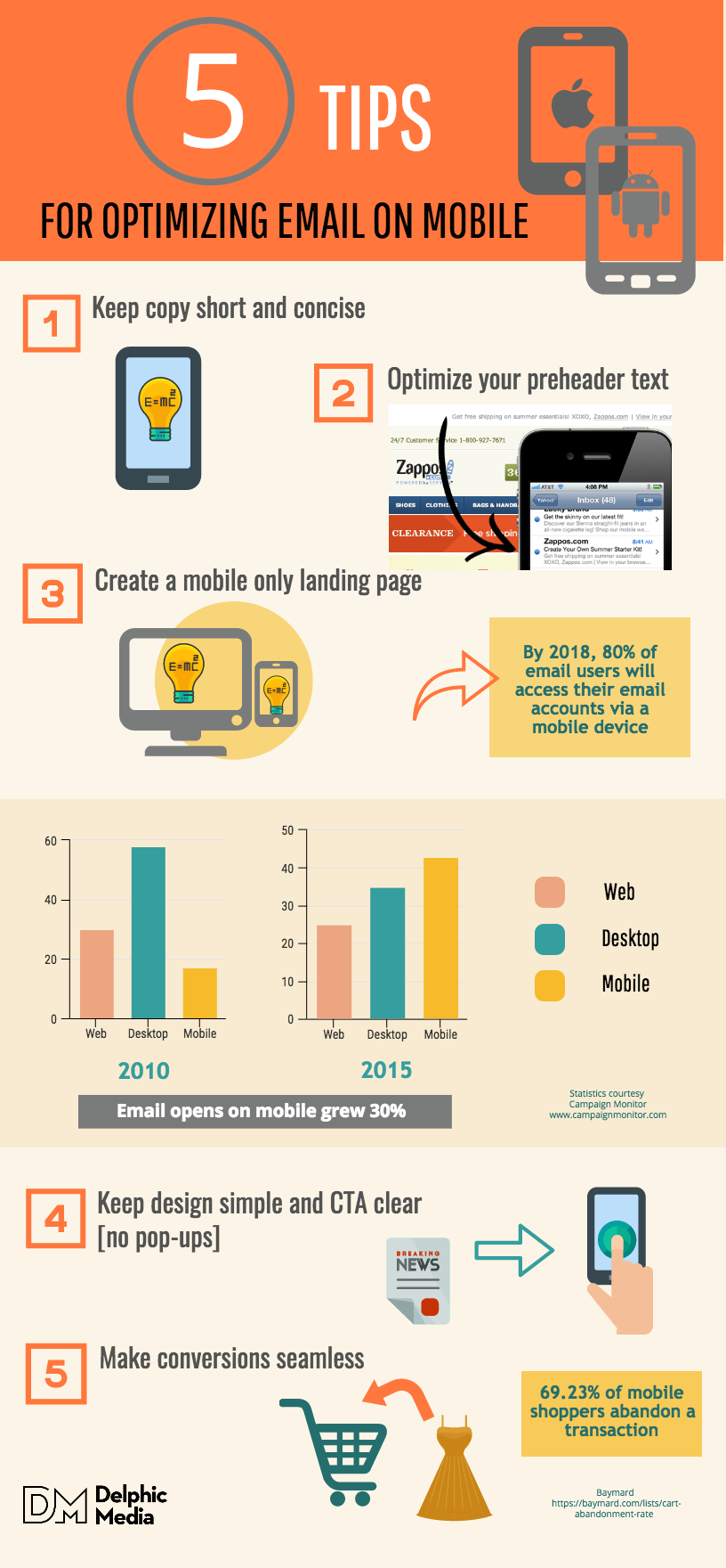
Technology Market Research firm, The Radicati Group, predicts that by 2018, 80% of email users will access their email accounts via a mobile device. That sounds about right. Walk down any city street and practically everyone is glued to a smart phone. In New York, people walk out into traffic while on their phones. I’m not saying that’s an ideal scenario but I witness it daily. The upshot? Mobile email opens will surpass that of desktop and webmail. As a result, responsive design can’t be an afterthought. Right now, Email opens on mobile devices have risen from 27% in 2011 to over 50% in 2016 That’s a significant percentage and smart marketers are busy devising strategies that will capitalize on a mobile movement that is dependent on email.
People search mobile devices for the most relevant information they can find. It doesn’t matter who delivers the message; if it’s the right message, it’s a win. This demands marketers become adept at delivering relevant content to a specific audience at the right time. Responsive design is a part of that conversation. Once you know who your audience is and what they want, you can refine the message for responsive email.
According to the 2017 State of Email Report by Litmus, it’s essential to create mobile-friendly emails along with mobile-friendly landing pages. How to do that? Personalize the mobile experience. “Mobile-friendly” assumes a level of personalization that consumers have come to expect. Along with this, streamlined design and targeted messaging are non-negotiable, particularly with Goggle’s move late last year to put mobile-indexing ahead of web.
Also, late last year, iOS 10 began to include list-unsubscribe at the very top of every email. This makes it a snap for subscribers to opt out of your newsletter. That’s even more reason for content to be appealing and focused.
According to Shelley Kessler, Manager of Reporting and Analytics for Experian Marketing Services, “Consumers expect their interactions with a brand to be dynamic and personally relevant … a brand that recognizes a subscriber by name in the subject line of an email is able to establish an immediate, personal connection with that subscriber … campaigns with personalized subject lines achieve higher open rates than those with subject lines that are not personalized.”
What were the numbers? Experian found that personalized subject lines resulted in a 49% increase in transaction rates and 41.8% increase in open rates. A “mobile-first” email strategy is just plain smart. As you think about what to implement for mobile email success, here are 5 things to keep in mind:
1. Keep copy short and concise
You’ve got lots of room on a desktop to wax poetic but real estate on smart phones is demonstrably smaller. Distill your content to include the most relevant points. Make sure key benefits are visible in the first few lines of your message.
2. Don’t forget to optimize your preheader text
The preheader is the short summary text directly after the subject line of an email. It’s automatically pulled from the first 75-100 characters of your email copy and displayed underneath the sender name and subject line in a subscriber’s inbox. In desktop email clients this would be called the “preview pane”. To avoid the automatic display of administrative content such as, “Having trouble viewing this email?” make the first lines of copy about the message.
3. Design a mobile only landing page
A separate page for mobile users is mandatory. Consumers using mobile are accessing what they need, or want, while on the run. Plus, they are probably multi-tasking so your email is competing with tons of distractions. Every element has to deliver. If you want conversions on mobile, you need landing pages created for mobile users.
4. Keep email design simple [no op-ups] and your CTA clear
Use one column to avoid stacking on smaller devices. Single-column layouts should be no wider than 500 to 600 pixels. Links and buttons need to be at minimum, 44 × 44 pixels. White type on black is evil – never, ever do it. Stick to fonts that will render across most devices like Helvetica, Arial, Trebuchet MS, or Verdana. Also, make sure your CTA [Call to Action] is big and has enough white space around it so that it’s easy to click.
5. Make Conversion Seamless
According to market research company, Latitude, 63% of people plan on doing more shopping on their mobile device. The problem is that an average of 69.23% mobile shoppers will abandon a transaction if the experience is not optimized, according to web usability research institute, Baymard. I know that’s true because I’ve abandoned lots of mobile shopping carts for being too clunky.
It’s safe to assume that adapting a “mobile-first” email strategy is going to top the list of marketer’s “must-do”. Once Goggle’s “mobile-first” index is fully implemented there will be no more choice. It means Google will consider mobile versions of web pages as the primary page to index, leaving desktop versions in second place. Will you be ready?
If you need an email strategy, let me know. Cheers
5 tips to optimize email on mobile